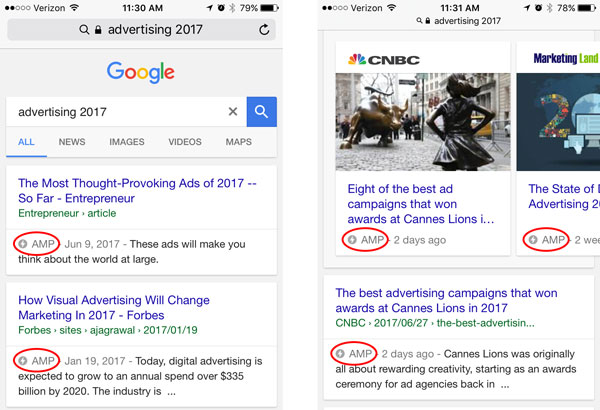
 If you’ve recently performed a Google search on your mobile device, you may have noticed a series of featured boxes pop up at the top of your results that contain a small lightning bolt ⚡ and the letters “AMP”.
AMPs, a project backed by Google, are actually part of an open source initiative led by publishers (like Twitter) and technology companies who were looking to improve the mobile experience by speeding up content load time.
But, wait… Aren’t most thought-out, responsive websites already optimized for mobile? (We hope you’ve optimized your site after Google’s mobile friendliness update!) Yes, however the mobile browser pages still may not load quickly, which can be upsetting to users and actually turn them away from your content before even seeing it.
Let’s get technical for a minute. According to the AMP Project website, AMPs are like any other HTML page, but with specific JavaScript components available defined by the open source AMP spec. In other words, pages are designed to be read, not necessarily interacted with, because they are stripped down.
That’s probably why you’ll mostly see news publishing sites using AMPs, rather than a fully-interactive site that needs to compel users/customers to take action.
Also contributing to the speed is Google AMP Cache, which methodically caches copies of AMP content so that Google can host these AMP pages, rather than having to fetch them. This means you get your content at lightning speed.
So, is this all just a need for speed? Partially. But in a less cynical world, this really is a need for improving the user experience. And with mobile web browsing traffic recently surpassing desktop browsing, mobile users are now more of a priority than ever.
Ready to get moving? Learn more about Accelerated Mobile Pages on the project’s site here, and get your AMP pages displayed properly in Google search by using these Google guidelines.


Comments