Imagine if every time you went into a particular restaurant, your favorite dish looked, smelled and tasted different. Maybe an ingredient is missing, the portion size is smaller or the presentation has changed. Maybe it’s all of these things, depending on the kitchen staff that day. It’s easy to see how this may lead to confusion, disappointment and even hesitation to recommend this restaurant to family or friends—or to even return there yourself.
So what does this illustration have to do with brand guidelines? Everything.
A guideline is a set of standards, values and beliefs—whether it exists for food, healthcare or marketing. When your stakeholders, employees, sales staff, designers, writers, developers, agencies and vendors have no consistent “recipe” for how your brand should be served up, it changes the way it’s perceived in the marketplace. And for some, it may even contribute to it not being noticed at all.
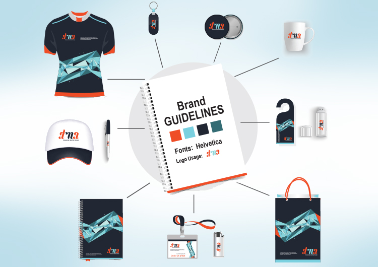
So what exactly are brand guidelines and what should they include? There’s no one-size-fits-all. They can take the format of anything from a single page to an elaborate hardbound book. In their simplest form, brand guidelines are a set of rules that spell out how to use the elements of your brand to create a unified look and feel at every touchpoint.
Common Elements Found in Brand Guidelines
Mission/Vision/Values
Documenting your mission, vision and values in your brand guidelines helps keep everyone on message and focused throughout all communications and inspires employees to be brand advocates.
Logo Usage
Your logo is probably the most-used element of your brand. As such, it’s important that its usage is clear. Guideline specifications should include minimum clear space around the logo, logo/tagline lockup, size requirements, color options, and its use on various backgrounds.
Color Palette
Maintaining a consistent color palette allows your brand to be recognized and to stand out from the competition. Saying your logo is yellow isn’t enough. Brand guidelines should include Pantone, CMYK and RGB color codes for primary and secondary color palettes.
Fonts
In addition to font families, it’s important for guidelines to specify when and where to use each font, as well as sizes. Showing an example of a marketing piece with callouts of font usage is a great way to demonstrate this.
Imagery/Icons
Does your brand always use lifestyle imagery? Product shots? Illustrations? Establishing a consistent set of principles—and a library if possible—creates less confusion for your designers and your customers.
Voice/Tone
What you say and how you say it is a reflection of who you are and what you stand for. While the exact messaging may change depending on the audience or intention, a brand voice and tone should be established across all forms of communications whether written, audio, video or even phone conversations.
But Why Are They So Important?
There’s a reason companies of all types and sizes create brand guidelines. Actually, there are many. Below are some of the most important.
To align with your mission, vision and values
For many companies, their mission, vision and values are nothing more than words on a website. When you incorporate them into everything you do—both visually and verbally—they become much more.
To create consistency at every touchpoint
With brands being seen in more places than ever before—including social media, in-game and even on police cars it’s important to have consistency at every touchpoint. Something as simple as a color palette (think Google) can be an immediate mnemonic to a customer or prospect recognizing your brand. (more about that below)
To make your brand recognizable and memorable
In a day and age when everyone’s in a hurry, being able to recognize a brand has become more important than ever. Let’s say you were driving your kids back from a game in a town that you’re unfamiliar with and everyone is starving. As you continue on your journey, you see something that’s very recognizable to you (and your kids)—the golden arches. You turn in, order your usual, and everyone is happy. But what if that brand followed no guidelines? What if the universally recognized logo mark and color of those arches was suddenly different? You would probably drive right by. And, most likely, you wouldn’t be the only one.
To improve efficiencies
What if every time you needed a flyer or brochure, the elements had to be created from scratch—forcing designers to spend their time choosing fonts and colors, searching for visuals and determining logo placement and other design elements that may or may not match what’s already out there? Brand guidelines will allow them to quickly access CMYK and Pantone colors, primary and secondary typefaces and logo placement rules—saving something every business could use more of: time and money.
To help motivate and ground existing employees
Brand love has to come from within. That’s why it’s important that once you establish your brand guidelines (or if you change them), your employees be the first to know. After all, they are living and breathing the brand each and every day.
To help attract and onboard new employees
Good branding may not only sell potential customers on your company, but also potential employees. Projecting strong values and beliefs is a magnet for attracting top talent. Once hired, the brand guidelines will quickly and easily help new employees understand how to use the brand elements, right from the get go.
You Know Your Brand. Now Make Sure Everyone Else Does.
Of course there are many reasons to have set brand guidelines in place. Remember, they don’t have to be elaborate or fancy, they just have to serve as a resource on how to use your brand elements consistently for anyone who touches your brand.


Comments