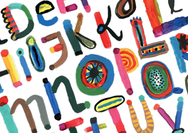
 Typefaces are far more than a design choice. They’re a strategic choice that can impact what readers think of your content. We’ve compiled a bit of evidence to show just how much of a difference a typeface can make:
The Morris Experiment
Writer and filmmaker Errol Morris conducted an experiment in 2012 to see if typefaces could influence people’s beliefs. Under the auspices of a survey about optimism and pessimism, Morris asked readers of the New York Times online edition whether or not they agreed with the statement that “We are living in an era of unprecedented safety.” Some people saw the statement in Baskerville. Some saw it in Helvetica. Others saw it in Comic Sans.
The results showed that people who saw the statement in Baskerville were most likely to agree with it. The differences were small but significant enough to be more than chance.
The Term Paper Exercise
In 2006, Canadian design student Phil Renaud was surprised to suddenly be getting better grades on his term papers. He couldn’t imagine why there would be a change. But, after some thought, Renaud noted that he had switched typefaces.
Renaud had written a total of 52 papers — 11 set in Times New Roman, 18 in Trebuchet MS, and 23 in Georgia. The Times New Roman papers earned an average grade of A-. The Trebuchet papers earned only a B- average. The Georgia essays delivered a solid A.
The Research Results
About ten years ago, Samuel Juni and Julie S. Gross, researchers from New York University’s Department of Applied Psychology, conducted a study of the impact of typefaces on students’ responses to satirical readings from the Times.
Below is the abstract from their paper, which was published in Perceptual and Motor Skills in February 2008.
“The aim of this study was to explore the latent affective and persuasive meaning attributed to text when appearing in two commonly used fonts. Two satirical readings were selected from the New York Times. These readings . . . were each printed in Times New Roman and Arial fonts of the same size and presented in randomized order to 102 university students, who ranked the readings on a number of adjective descriptors. Analysis showed that satirical readings in Times New Roman were perceived as more funny and angry than those in Arial, the combination of emotional perception which is congruent with the definition of satire. This apparent interaction of font type with emotional qualities of text has implications for marketing, advertising, and the persuasive literature.”
In short, two commonly used, well-respected typefaces delivered significantly different results in readers.
Imagine that something as simple as a typeface change could improve your sales or raise your perceived value among prospects. Would Baskerville make your white paper feel more authoritative? Would Georgia get you higher marks from those who read your sales literature? Could Comic Sans sink your direct mail campaign? It’s worth thinking it over.
Interested in exploring the power of typography with a collaborative team of marketing professionals who thoroughly understand how to create effective communications? Reach out to us at Imbue.


Thanks, I enjoyed this. I remember having to edit a long textbook in Souvenir, which is right up there with Comic Sans in my opinion, and it was torture. There are things I won’t read because the typeface is so awful.