A lot of thought goes into good design. For instance, if you were building a home for someone in a wheelchair, a spiral staircase wouldn’t be a good design decision. Or if you were designing a car for someone who was extremely tall, a short compact wouldn’t make much sense. These are pretty obvious examples, but the point is, when designing anything, the most important things to consider are the needs of your audience.
This same logic holds true when designing emails, videos, websites, banner ads, print ads or any advertising or marketing materials where you want to get your message across to as many people in your target audience as possible. To achieve this, it’s important to take into account how people with certain disabilities or who are viewing your design in specific environments will see, hear or process it. This doesn’t mean you must compromise the aesthetics of your design. Sometimes limitations force us to think about things in ways we would not have otherwise—leading to more beautiful and unique designs that are also positive, accessible design experiences for everyone.
6 Tips for Creating Accessible Design
We recommend taking a look at your website, email templates, videos and other marketing materials with a fresh perspective and keeping these 6 tips for creating accessible design in mind.
Use Contrast
Many people with poor vision or varying degrees of color blindness have trouble distinguishing between different colors and tones on a page or screen—for them it may look like everything is blending together. By using high contrast between backgrounds and text, you can ensure better readability for a larger percentage of your audience. A simple way to do this is by using a monochromatic color scheme and varying the intensity within one color family. For instance you may have a light blue background with dark blue type. High contrast offers a great deal of readability for everyone, even those without color blindness.
Web Content Accessibility Guidelines (WCAG) recommend the contrast ratio be at least 4.5 to 1. For larger type of at least 18 point, the ratio can drop to 3 to 1. There are many apps available like Contrast Ratio, material.io’s Color Tool and more that will help you calculate your contrast score and see exactly what individuals with color blindness or other common color vision impairments will see to ensure that you are meeting both minimum requirements and your own design standards.
Never Rely on Color Alone
There are lots of studies surrounding the use of color to tell a story, elicit a response and create emotion. However, despite the power of color to do all these things for a large percentage of your audience, there are some people who either can’t distinguish between certain colors because of color blindness or who can’t appreciate their symbolism because of cultural differences that could cause colors to have different meanings. In fact, in a recent study of adults over the age of 58, it found that more than 40% had some type of abnormal results on one of two color vision tests. And of those affected, 80% of them involved confusion of lighter shades of blue versus purple and yellow—which is completely separate from individuals with the more common red-green color blindness.
For this reason, it’s important to never use color alone to convey important information or indicate action. Always provide alternatives in the form of text, icons or patterns so that even if the meaning of the color is missed, all won’t be lost.
Give Buttons Their Space
Buttons and controls that are too close together or too small can prove to be a challenge for older viewers whose hands may be shaky, those with a condition or injury that causes poor motor skills, anyone with compromised vision, or for individuals using a smaller device.
To optimize viewers’ actions and minimize their aggravation, ensure buttons and links are large enough to clearly see and there is sufficient space between them so that the user doesn’t accidentally hit the wrong one. Google recommends that any button or control is at least 48 by 48 pixels in size and is spaced at least 32 pixels apart.
Limit Movement
While movement, animation and parallax can help call attention to webpages, videos, banners and apps, for many with medical conditions or sensitivities, these elements could cause annoyance, anxiety, headaches, dizziness, nausea and even seizures. Does that mean that you should never use these effects to draw attention to your design and engage your audience? Not at all. Just be sure to pay close attention to when and how you use them and provide an opt-out by allowing viewers to control, hide or bypass the motion or animation.
Choose Your Fonts Wisely
Years ago, most designers used a standard font size because there were more standard ways to view a message. Today, with so many device sizes and shapes, designing with fixed font sizes is no longer a viable option. The general acceptable size for body text on the web is 16px with headers and bullets being proportionately larger or smaller. It’s also stated in the WCAG guidelines that all text must be able to be resized up to 200% of its original size by users. For printed pieces, 10pt is standard copy size. However, as always, you should consider your audience and may want to adjust it for older audiences who have trouble seeing close or those with impaired vision.
Size isn’t the only thing to think about when considering accessible design for your audience. It’s also important to consider which font types and cases are most readable. As a rule, italicized and script fonts and all uppercase letters tend to be the most difficult to read for the majority of audiences—especially when text is on the longer side. If someone has to spend extra time to read your message, they will likely abandon it and move on. This is especially true now, as people are busier than ever and you need to grab their attention and get your message read in a matter of seconds.
Describe Images Clearly
Those with vision impairments often rely on screen readers to transcribe and narrate text, making your message accessible to more people. However, when a key part of your message relies on the image to tell the story, this audience may be missing out and not understand the full benefit of your story. So one way to ensure this doesn’t happen is to avoid using images to display important information. However, if you feel strongly about doing so, make sure you provide alt-text descriptions so that screen readers can pick up the information and share it with your audience. The key to writing good alt text is to keep it simple—125 characters or less. Don’t start with “image of” or “picture of” just describe the image and make sure it’s specific enough to be relevant to your story. You should optimize your alt text for SEO when you can, but keep keywords to a minimum and only choose the most relevant ones. This same tactic should be used with any icons, buttons, charts or graphs.
Bottom Line
There are no hard and fast rules for every piece you design. Before putting marker to paper or stylus to screen, you should consider your audience, your medium and your intended goals. Using these simple guidelines can help, but in the end, it comes down to your common sense as well as your sense of accessible design.
Ready for more? Our free resource library, Imbue U(niversity) is a great place to learn about branding, design, marketing, and advertising from the team at Imbue Creative!

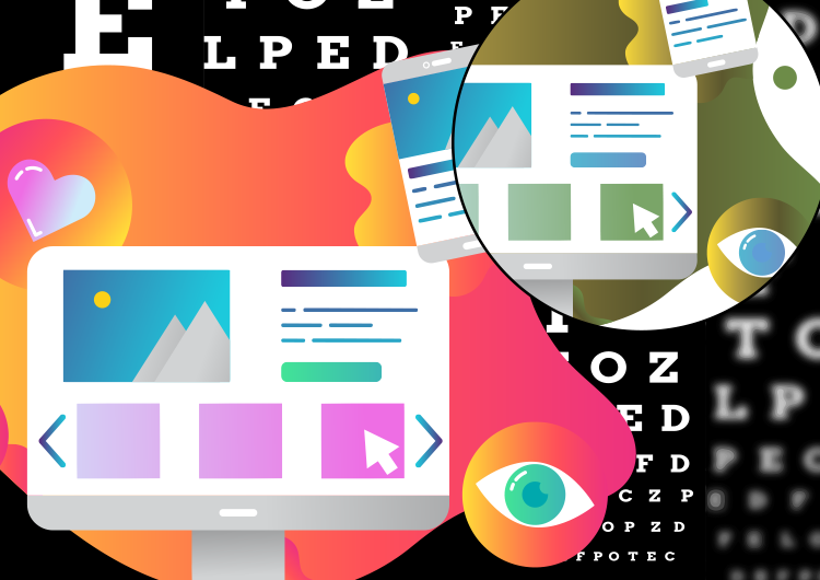
Accessible design is essential these days as more and more people are working towards creating an inclusive internet.